PlutoPay: E-wallet Money Manager
The Challenge
Individuals need a way to store their bank and card details in one place because this allows them to shop, transfer money and more without the use of a debit or credit card.
The Goal
Our web app will allow users to manage their daily financial activities, including budgeting tools, shop in-store, and transfer money safely and securely from anywhere to anywhere worldwide. This web app will allow the user to control multiple accounts in one place without using a physical debit/credit card or needing to visit a physical bank.
Industry
Financial Services
My role
Research, Ideation, Information Architecture, Wireframing, UI Prototyping
Project Scale
9 Months
Tools Used
Zoom, Google Meets, Skype, Descript, Google Forms, Lysine, Pen & Paper, Figma, Marvel, Loom, Sublime Text, Stark, ScreenPal

I found it insightful to research possible competitive companies for this web app. I decided to focus on these 3 companies (PayPal, Apple Pay and Amazon Pay) because they are at the forefront of digital Financial activities, all doing different things.
Competitive Analysis


User Research
User Surveys
I had some exciting quantitative data from the user surveys and it allowed me to be more aligned with what I was going to ask in the user interviews. One of the interesting points was that I discovered banking apps I had not heard of before. Below I have highlighted in green the areas of high interest and outlined these in the survey results on the slides below. Three main takeaways are;
Users use PayPal and Apple Pay most when purchasing online.
Users expected two-factor and biometric technology for security within banking apps.
Users felt their financial app could do more by having bespoke budgeting features or streamlining money management.


User Interviews
I found some fascinating feedback from the user interviews that led me to create many different affinity maps.
Users seem to use different accounts to manage their money, which is why one place to manage multiple accounts would be great, so they do not need to log in and out every time.
Users felt they needed more visualisation of their budgeting and money management needs.
Incorporating NFC technology when splitting a bill with a friend.


User Personas
Originally I structured my Post-it notes into these four key areas of behaviour; Money management, Transferring money, Shopping Online and Security. However, I reorganised these into the user’s motivations; frustrations, needs and expectations which helped identify the focus for user personas.
Identifying these key areas of motivation allowed me to focus fully on what the users are expected to gain from the app and also achieve some of the pain points they were facing. The persona is a great tool to share with your team to keep everyone aligned.

“It’s annoying trying to remember my password when shopping online.”
— Andrew
“That external device from HSBC. The two factor authentication thing. That's just awful.”
— Aoife
User Flows
Working through the possible steps the user might take to do their task was extremely interesting, but I felt I could have been slightly biased for me to think of this rather than taking reference from a few existing apps. I will be exploring both these two examples when adapting user flows in the future as I feel that reference from existing apps and how the flows might function better would be important for the user. In the end, this was a useful part of the user journey and this helped with determining the sitemap.

Sitemap
My first draft of Information architecture was extremely complex to try and get in all the different features. I have shown both versions of this below. As you can see the second version is a lot more simplified.
I felt this was the first time I started to design the app and decided what features were important and what the layout of my app was going to be. By pulling all together, the user flows, user scenarios and the motivations and goals that my personas wanted to achieve were very challenging but an important part to get right. In the future, I might look at how other competitive apps do their site maps for reference, which might support and speed up this task. It was really exciting to see the overview of the web app start taking some shape.
Card Sorting
This was mainly from doing the Card Sorting exercise with my users.
I felt this was the first time I started to design the app and decided what features were important and what the layout of my app was going to be. By pulling all together, the user flows, user scenarios and the motivations and goals that my personas wanted to achieve were very challenging but an important part to get right. In the future, I might look at how other competitive apps do their site maps for reference, which might support and speed up this task. It was really exciting to see the overview of the web app start taking some shape.
Creating the card sorting was a great insight and made me realise to always refer back to the user to guide decisions.
Version 2
I have shown both versions of this below. As you can see the second version is a lot more simplified.

Mid-Fidelity Wireframes
I did the first sketches with pen-and-paper, and quickly moved to digital as I felt it was a better of adapting quickly and a better way of presenting. I realised that for inspiration I looked at more typical banking apps to figure out what their flows were for coherency and easy usage.
I have presented two versions of the Sign-up and Onboarding, as the first version was too simple and I discovered I needed to include more screens as the Onboarding process is key and it is complex as it is a highly secure account that you are creating and that is why I wanted to showcase the vastness of it.


Usability Testing
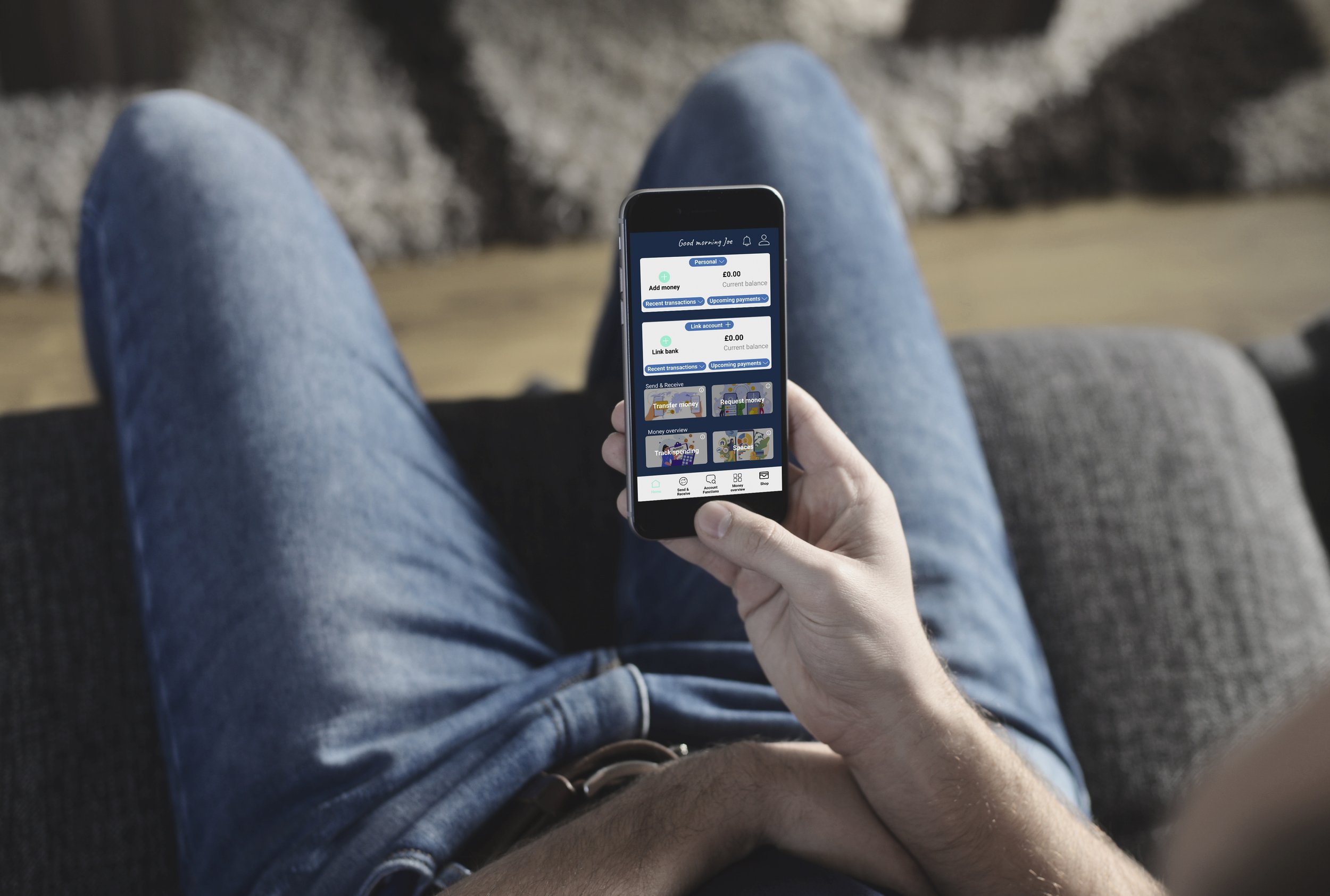
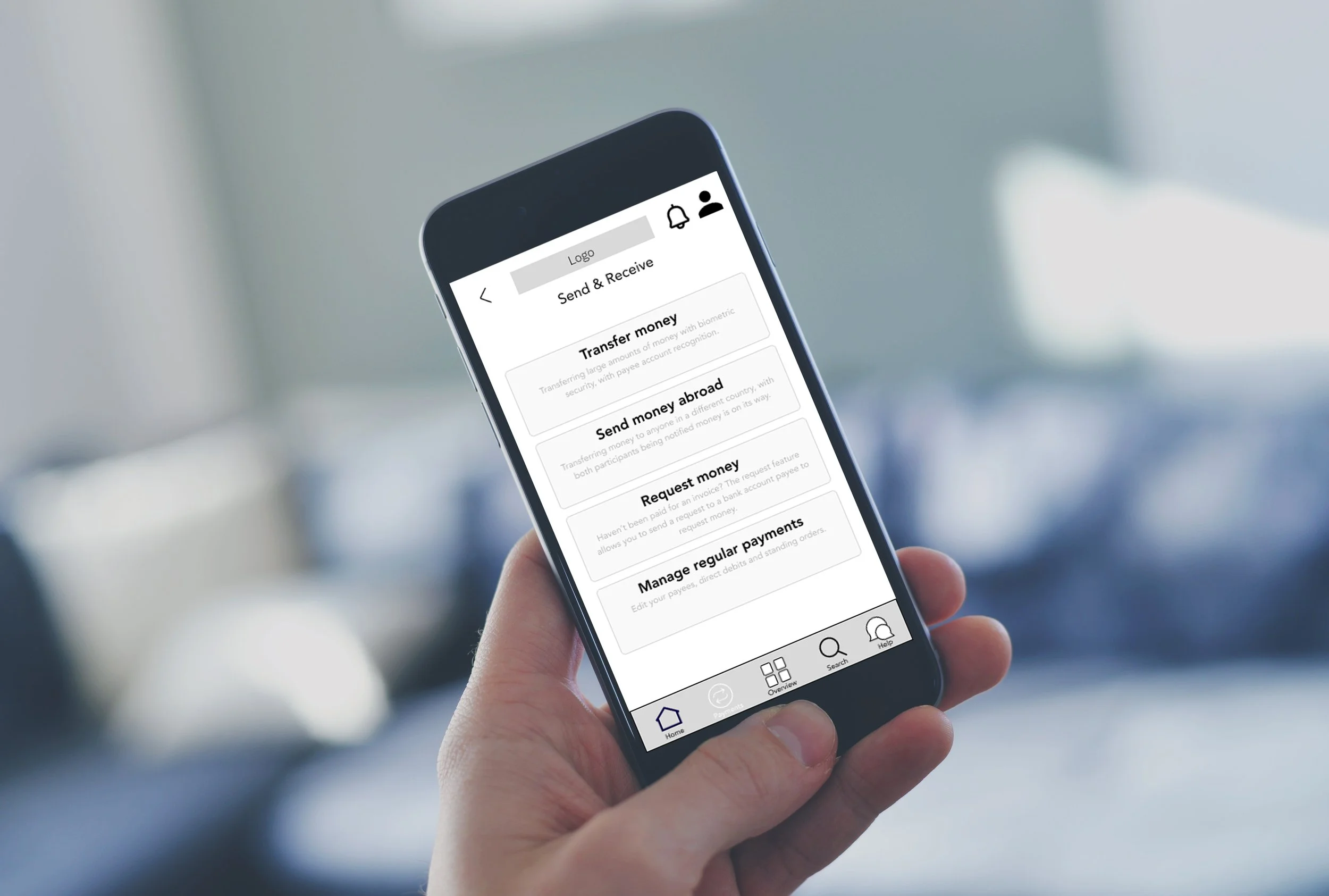
Here are some of the Mid-Fidelity wireframes that I created in Figma that are made using a clickable prototype for testing with my users. I needed to get further feedback from my users to see if I was delivering and improving on some of their pain points that had come to light in the research stages, like user surveys and user interviews.
I have also included various screens in the mock-up settings of the clickable screens from the prototype.


Test Results
Once again I had some really insightful feedback by doing an affinity map from the Prototype. I first started organising it using the Positive and Negative quotes, Observations and Errors. However when I went through the process of changing the app in Figma to suit the feedback received I decided to organise this feedback into other areas such as onboarding, sign-up, etc to speed up the process in a list form. I realised the whole app needed work rather than particular details. It was clear that I needed to redesign a lot of the web app as the navigation was not clear. Below are some of the key learning points that came out from the Affinity map.
I also did a Rainbow spreadsheet that allowed me to organise my feedback from the usability tests into the key areas and document possible solutions and next steps.

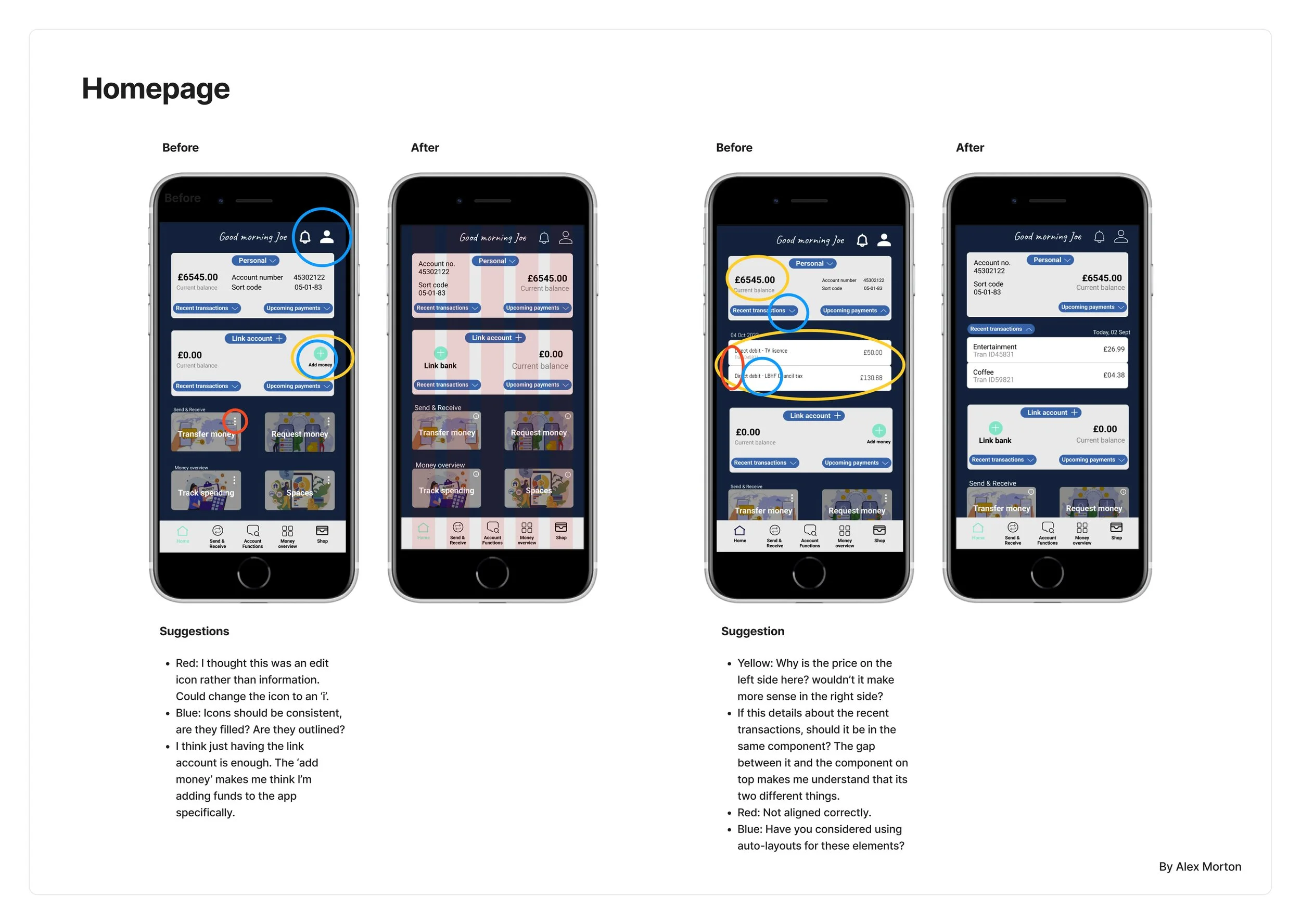
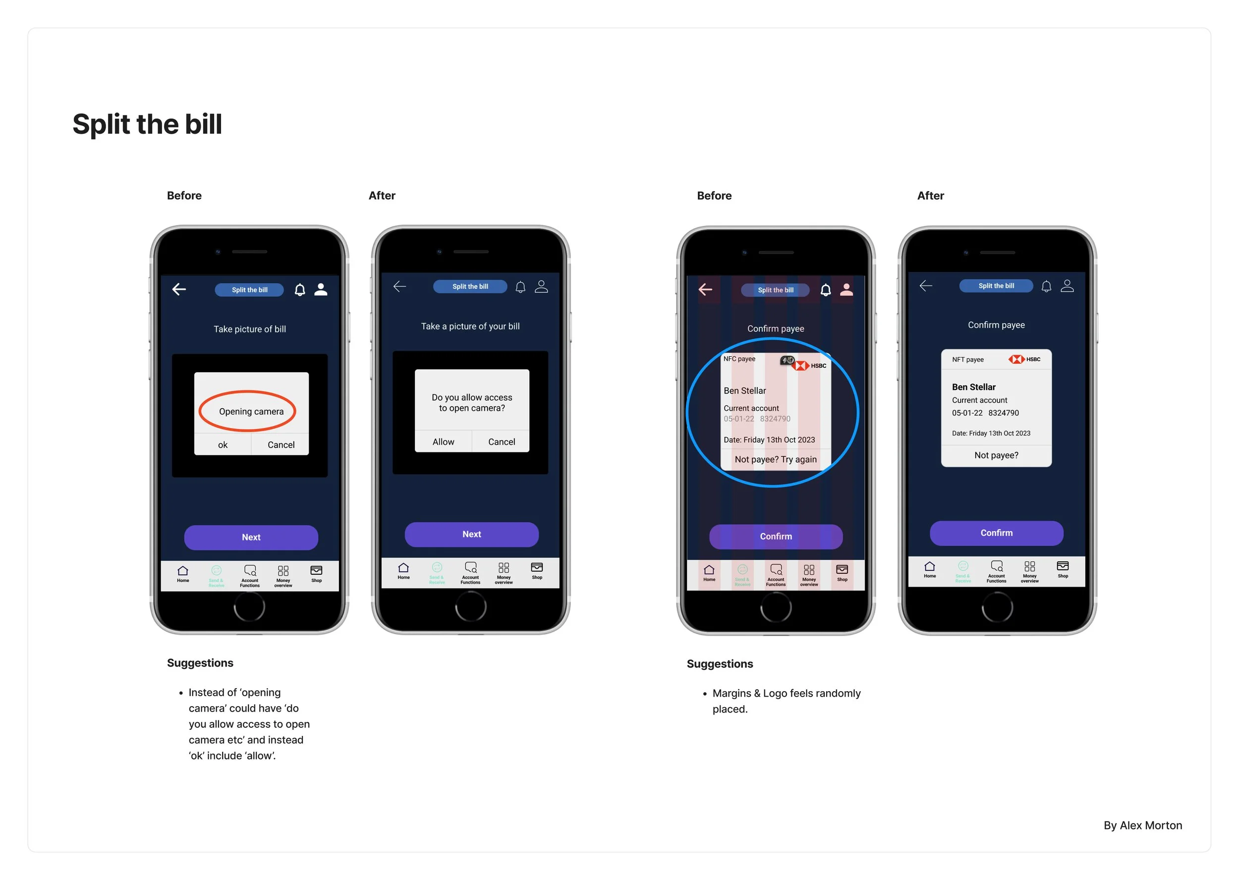
Findings & Recommendations
Identifying and organising the feedback from the previous stage allowed me to implement these findings. As there was a lot that needed to be changed. I decided to redesign the app using this feedback and also go back and reference the personas to make sure I was identifying their goals and needs. Trying to make the app simple yet dynamic and fit into similar app layouts.
Below are three of the main high-level issues of before and after screens of the changes made. I think with more experience in the future, I would not have to do a redesign, but only simple changes during this stage of the process. I feel the updated versions are more fluid and cleaner. I have tried to reduce the number of clicks and think more from the perspective of the user.


UI Design Documentation
Creating aligned brand guidelines or in this case, Style Guide and Design Language is a vital tool for communicating to the engineer and your team as a whole. It is important to make sure everything is clear and included within the document, so they can reference this document when building the web app. Below are the colour and typography guides with mock-up screens for an example.
I also made sure I included all UI elements and communicated the correct terminology for each component. Trying to make full use of the various drop-down menus to reduce the number of clicks the user might have to take to get to their desired goal. Adding version colours to the same field to illustrate to the user their progress. Including labels for fields to guide the user.
I tried to make sure the iconography was familiar and impactful to the user, so they achieved their task with ease. Understanding the grid system was helpful when aligning the elements and components. This system made the design much cleaner and organised once the grid of 5 columns with a gutter of 16 pixels.


Design Collaboration & Revisions
It was difficult to find participants to do the testing and give me feedback, so I sorted through personal invites on the Slack channel, and then I started direct messaging the ones who had viewed by prototype of Figma. The quality of the feedback varied massively compared to the click dummy and the files. This was because I offered two options, a click dummy and a PDF file, which put back on the files the flows were not clearly communicated and thus caused more confusion. However the results were insightful, with simple steps on how to improve my prototype. Below are a few examples.
The feedback I received was really helpful. Once I made the changes it improved the way the app communicates to the user and overall feel feels more pleasing. I will be using this method in the future at this stage of the process.


Summary
This was a great project, it was insightful to discover that so many people use so many different banks to manage their money and so many banks did not think of the user first. We are so used to technology doing everything for us, that banking apps need to be familiar and responsive like other apps. This project has given me a better understanding of the process of UX design, I learnt some exciting areas of how to explore and evaluate research. Understanding how users complete tasks and their journeys is something to improve on in the future, as this will deliver better results for the users and their goals.
The hypothesis statement has changed a bit according to the research & insights that I gathered through the testing so the focus of the app might have changed slightly rather than what we started in the beginning. The web app will allow users to manage their daily financial activities, including budgeting tools, shop in-store & online, and transfer money safely and securely from anywhere to anywhere around the world. This web app will allow the user to control multiple accounts in one place without the use of a physical debit/credit card or the need to visit a physical bank.
What I would do if I had more time and this was a real project with real clients, is to look back over the areas of managing money and savings features. This is what I would be excited to explore further if this project would continue. Another round of user testing and possibly user interviews are needed to make sure everything is working correctly to be handed off to the development.
Final Design


